(Source: IFLScience)
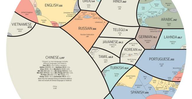
This beautifully illustrated infographic (above), designed by South China Morning Post’s graphics director Alberto Lucas Lopéz, shows the most spoken known languages in the world and where they’re spoken by the 6.3 billion people included in the study.
Based on records collated from the database Ethnologue, the infographic illustrates the wide-ranging facts and figures of the world’s living languages catalogued since 1951.
“There are at least 7,102 known languages alive in the world today. Twenty-three of these languages are a mother tongue for more than 50 million people. The 23 languages make up the native tongue of 4.1 billion people,” says Lopez on his infographic.
“We represent each language within black borders and then provide the numbers of native speakers (in millions) by country. The colour of these countries shows how languages have taken root in many different regions,” added Lopez.
You can see the full pie chart in all its technicolor glory here.


Thank you for the map, but use it with care. A few errors:
– There are 6.000.000 people in Switzerland that use German as their native tongue, though someone from more than 100 km north of Switzland will have quite some problems to understand two people speaking “Schweizerdeutsch”.
– Where is Austria? Most of those 8.5 Mio people grew up with German. Here the differences to “German German” are not that drastic but as a native speaker you recognize them at once.
– There are more German-speaking minorities, e.g. in Italy (Suedtirol), Belgum, France (Elsass) and Danmark.
Good points. I noticed that English speaking counties like Belize are not listed either.