This article originally appeared on the London Shortwave blog.

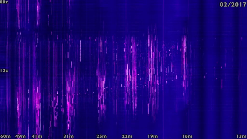
24-hour shortwave spectrum image, showing activity for a single day in the first week of February 2017 (©PA3FWM, Twente WebSDR).
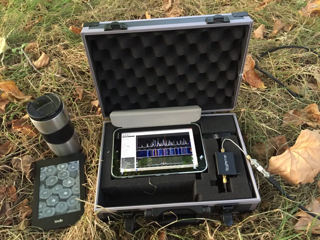
As many of my readers and followers will already know, these days I mostly enjoy listening to shortwave radio via the outdoor spectrum captures I make in my local park. Although I have built a system that helps me deal with urban radio interference at home, some of the weaker signals still can’t make it through the indoor noise. Since I have a limited amount of time for making outdoor trips, capturing entire portions of the spectrum allows me to record a lot of shortwave signals simultaneously, which I can then explore individually at a later time. However, these trips still need to be carefully planned because the time of the day and the time of the year both affect long-distance signal propagation, and do so differently depending on the frequency range. For example, signals on the 16 meter band are usually at their strongest during the daylight hours, whereas the 31 meter band is at its busiest around sunrise and sunset. Because my current portable recording set-up allows me to capture only 10% (3 MHz) of the shortwave spectrum at any one time, I decided to carry out a systematic exploration of activity on the shortwave bands to help me time my outings so as to capture as many signals as possible during each trip.
Luckily, I didn’t need to make any of my own measurements for this. For over a year, the wide-band WebSDR at the University of Twente has allowed its users to see what the shortwave spectrum has looked like over the past 24 hours in a single image. More recently, however, the creator of the service, Pieter-Tjerk de Boer PA3FWM, has opened up his spectrum image archives, so it is now possible to see the past conditions of the bands on any single day in the last two years. Intrigued by how band activity changes depending on the time of the year, I created a timelapse animation of these images by taking two from each calendar week and lining them up in sequence. With Pieter-Tjerk’s kind permission, I share this animation below.
First, a really fast version to illustrate the broad effects the time of the year has on peak activity times across the bands:
The X axis represents the frequency and the Y axis is the time of day, starting at the top. Conventional wisdom about band behaviour can be easily confirmed by watching this video: the 60m, 49m and 41m bands are mostly active after dark, with the 60m and the 49m bands being generally busier during the winter months. The 31m band is most active around sunset, but carries on all night until a few hours after sunrise. The 25m band is active during sunrise and for a few hours afterwards, and around sunset during the winter months, but carries on all night during the summer. Peak activity on the 22m and 19m bands is also clustered bi-modally around the morning and the evening hours, though somewhat closer to the middle of the day than on the 31m and the 25m bands. The 16m band is mostly active during the daylight hours and the 13m band is quiet throughout the year except for the occasional ham contest.
It almost seems as though someone positioned in the middle of the image’s right edge (corresponding to noon UTC) is shining two flashlight beams on the bands in a V-shaped pattern, and is changing the angle of this pattern depending on the time of the year: wider in the summer and narrower in winter. Here’s a slower version of the animation that shows some finer week-on-week changes:
Thanks to this data being made freely available, visualising and understanding these dynamics will help me schedule my spectrum capture outings in the weeks and months ahead.


This is fascinating! I would have never even thought to stitch all of this spectrum data together, but it is certainly telling. We’re always accustomed to seeing spectrum in real time or perhaps (via U Twente) per day. To see how spectrum shifts across the bands over the course of a year is simply amazing!
What a brilliant idea!
Thank you!
Thank you Thomas! It was great to confirm some of my own anecdotal observations as well as the information in the guides on Wikipedia and DXing.com. I might make a separate video for LW all the way up to 60m, too, though there’s probably less seasonal variation there (besides longer nights meaning longer DX spells). There’s a lot that can be done with that data!