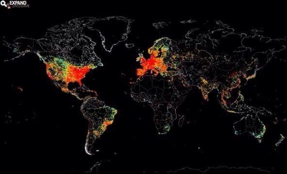
SWLing Post reader, Mehmet Burk, shares this tweet from Sherry Rehman:
Portrait of an unequally connected planet. A map of every device connected to the internet: http://t.co/TWZqtBVyf9. pic.twitter.com/B7NA4ZpWCN”
— sherryrehman (@sherryrehman) September 1, 2014
Many thanks, Mehmet!
Though this map may not be completely accurate since IP addresses in IPv4 can have thousands of devices behind a single IP, I believe it is a solid reflection on where the Internet is(n’t). Note that Africa is still very much in the information dark; shortwave and FM radio fills this void 24/7 in many rural communities.


I doubt this information is accurate. If we taker China as an example. China as of March 2014 had over 600 million internet users. 30% of that access the internet using G3 and soon to be G4. In rural China every accesses the interview from mobile towers. Taiwan with a population of just over 22 million have around 19 million that access the internet via landlines with the rest using G4.
Thats an awfully black bit covering much of Australia!
Maybe thats why the ABC ( not RA ) cover it with SW broadcasting from Tennants Creek, Alice Springs and Katherine. http://www.abc.net.au/reception/radio/shortwave.htm
This service tends to be hidden from many SWLers as it comes under ‘domestic’ rather than international and has its own entry on http://www.short-wave.info under ABC Northern Territory.
In WRTH its tucked away all by itself at the end of all the ABC domestic MW and FM stations.
Frank VK3JFH
Thanks for sharing this! Could the need for continued shortwave coverage be more obvious? Seems very clear-cut to me.
Robert ak3q
Considering that it’s based on IP address, I suspect that it may underreport regions, such as urban Africa, more heavily dependent on cellular data for Internet access. Urban Africa doesn’t show up well on the map, either.
These maps have always fascinated me and I do wonder how accurate they can be (as stated in the blog post).
There are plenty of graphical internet maps of the web around that are getting better all the time with my latest favorite showing usage by domain in a zoom-able colored dot effect.