Shortwave listening and everything radio including reviews, broadcasting, ham radio, field operation, DXing, maker kits, travel, emergency gear, events, and more
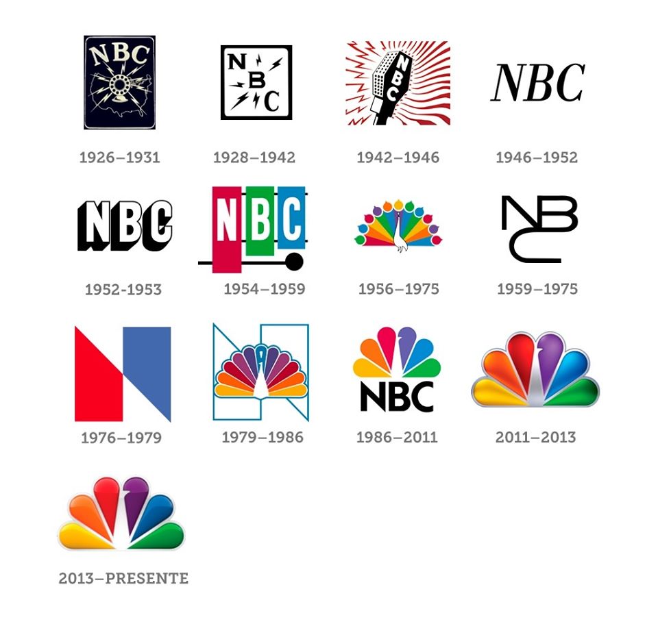
A member of the Old Time Radio Lovers group recently shared the image above that includes all of NBC’s logos dating back to 1926. Some of these are truly iconic.
Of course, versions of the rainbow peacock have been used most of my lifetime, so they’re immediately identifiable. I also like the NBC “snake” logo used between 1959-1975.
But if I had to pick my favorite, it would be the 1942 logo.
How about you? What is your favorite logo? Please comment!
If you have thirteen minutes today, do yourself a favor and listen to this excellent radio documentary about the NBC chimes from the podcast Twenty Thousand Hertz. It's fascinating! (Source: Twenty Thousand Hertz via 99% Invisible) NBC’s three little chimes didn’t just define a television network, they defined a generation. Where…
Many thanks to SWLing Post contributor, Dave Richards (AA7EE), who writes: Thomas - I know you've posted before about the NBC chimes, so I thought you might be interested to know that CHRS, the California Historical Radio Society, has acquired one of 8 original NBC chime machines. They don't think…
Many thanks to SWLing Post contributor, Curtis, who shares the following video from NBC Left Field: Hawaii's recent false nuclear missile alert showed us how reliant we are on cell phones and modern technology—and how unprepared we are if they become inaccessible. But in case the unexpected happens, an unlikely…
In "Emergency Preparedness"
Spread the radio love
6 thoughts on “NBC Logos throughout the years”
john b
42-46 mic logo is fantastic. I’ll have to copy that for a QSL card
The snake loses its charm unless you can see the animation. That and the peacock “The following program is brought to you in living color.” are the ones I grew up with. But putting them all together like this, the peacock on top of the black NBC seems to strike me as the most attractive. On the other side, that 1976 N was one dumb idea.
And that 1976 N cost NBC dearly in money and PR. Turned out that Nebraska Public TV used the same logo, all in red (Cornhuskers!). The network fell into third place and it took them years to dig out of that hole.
I grew up with the first peacock and the snake logos. But I have an replica set of the NBC chimes on the wall in my work office. NBC sold them in conjunction with the manufacturer in the late 50’s. Saw them in a music store window in Philly in the 80’s and snapped them up.
I like the 54-59 “chime” logo. It has post-war cool, and hearkens back to when the chimes were used to cover the sound of patch panel plug changes. They’re all interesting in their own ways.
42-46 mic logo is fantastic. I’ll have to copy that for a QSL card
The snake loses its charm unless you can see the animation. That and the peacock “The following program is brought to you in living color.” are the ones I grew up with. But putting them all together like this, the peacock on top of the black NBC seems to strike me as the most attractive. On the other side, that 1976 N was one dumb idea.
And that 1976 N cost NBC dearly in money and PR. Turned out that Nebraska Public TV used the same logo, all in red (Cornhuskers!). The network fell into third place and it took them years to dig out of that hole.
I grew up with the first peacock and the snake logos. But I have an replica set of the NBC chimes on the wall in my work office. NBC sold them in conjunction with the manufacturer in the late 50’s. Saw them in a music store window in Philly in the 80’s and snapped them up.
Very nice! I just looked up an original set* over at eBay. It was at $1200 and still bidding.
*I have no idea as to its authenticity. Just reporting what I saw.
I like the 54-59 “chime” logo. It has post-war cool, and hearkens back to when the chimes were used to cover the sound of patch panel plug changes. They’re all interesting in their own ways.